Information design for the Amyloidosis Research Consortium — translating a complex protein misfold cascade into a patient-accessible 2-page leaflet.
Context
Brief: Design and illustrate a patient-facing educational infosheet on AA amyloidosis — a serious but underdiagnosed complication of chronic inflammation. The audience: patients recently diagnosed, and their families. The constraint: the mechanism is genuinely complex, and the science cannot be simplified.
Background
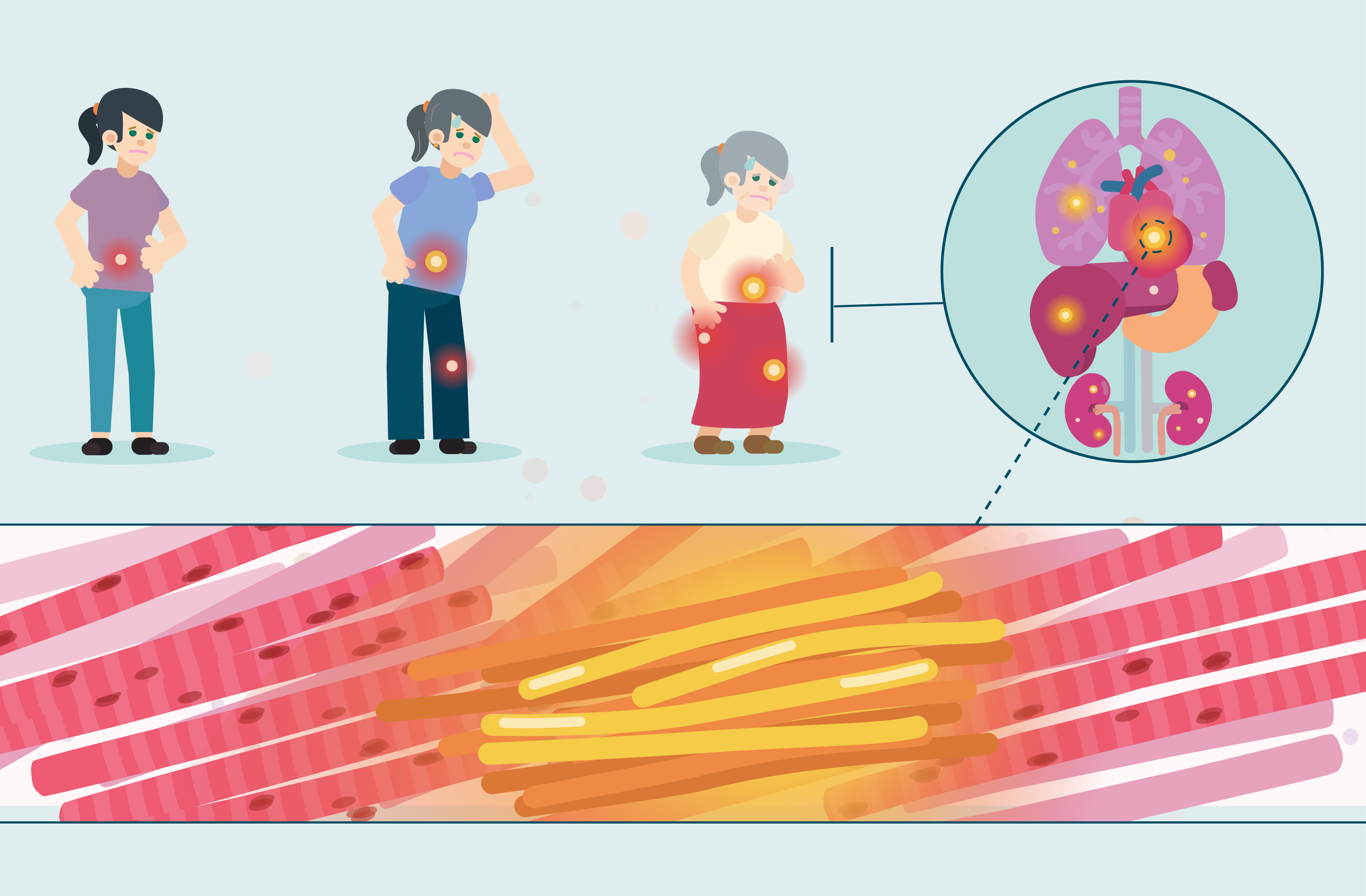
AA amyloidosis happens when chronic inflammation causes the cells to overproduce a protein called SAA (serum amyloid A). Normally, SAA is broken down once inflammation resolves. In AA amyloidosis, a fragment — AA — breaks off and misfolds into insoluble fibrils that deposit progressively in the kidneys, liver, spleen, and gut.
The design problem: how do you make a three-step molecular cascade (inflammation → SAA overproduction → AA fibril deposition) legible to someone who has just been told their kidneys may be failing — without reducing the science to the point where it misleads?
From first draft to final
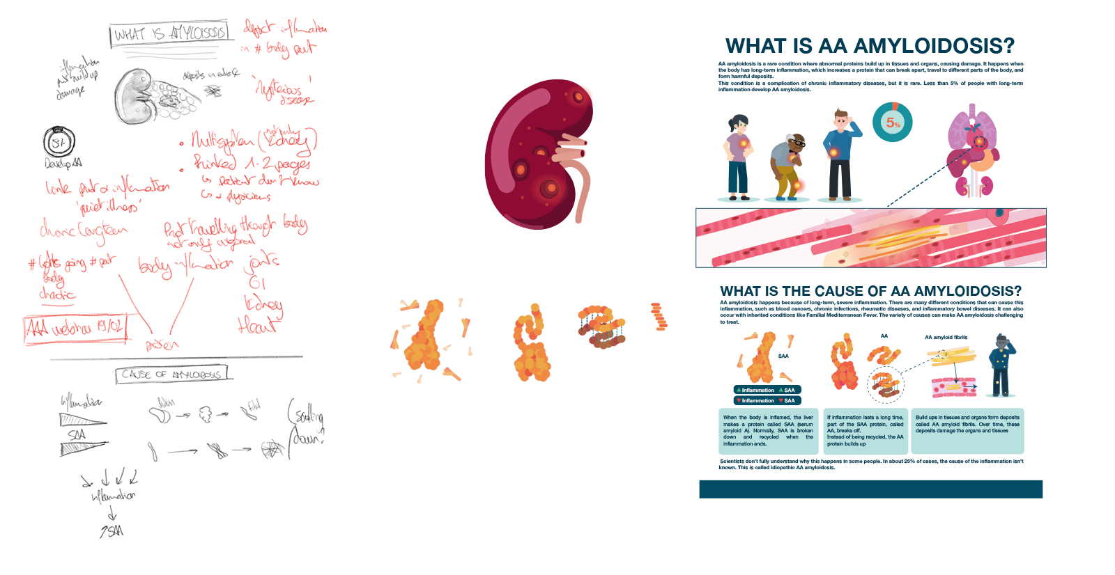
The design went through three distinct phases.
- The first draft was built in Fresco drawing directly with the customer. The priority was getting the information hierarchy right: what does a patient need to understand, and in what order? Layout, colour, and visual style were deliberately left rough at this stage.
- The design then moved into Illustrator and the visual language was established: the SAA cascade diagram, the organ involvement illustration, and the typographic system.
- In a 3rd stage, the layout and illustrations were refined to support the flow of information while keeping the story as simple as possible for non-experts.
Mid way through the process it was clear that the final product needed to be printed so we switched to a 2 page layout, cleared for both print (300 dpi) and web (72 dpi) export. The infosheet is accurate at the protein-biology level while remaining navigable to a non-scientist reader.
The latest, up-to-date version can be found on the ARC website. : ARC Infosheet
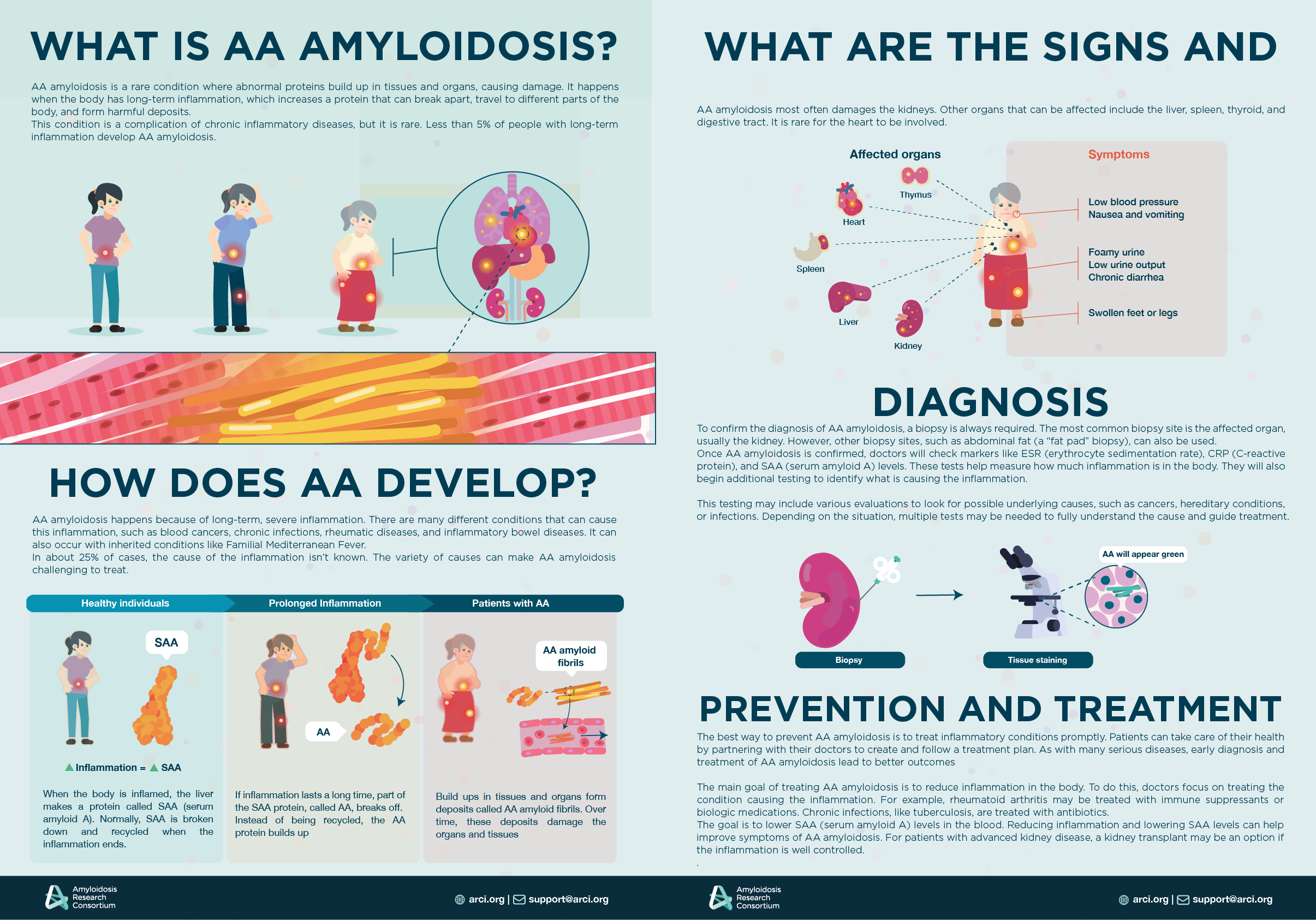
Delivered as a print-ready and web-optimised 2-page PDF. Produced in Adobe Illustrator.
Scientific content reviewed with the ARC team, developed with contribution from Ann Payne and Jessica Pastor.